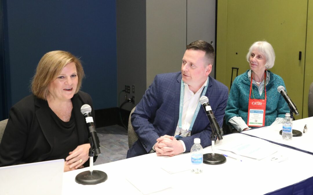
Eiseman — in the session entitled Extended Color/Design Trends: How Past and Current Events are Shaping the Future — offered a detailed overview of the four renewed palettes: Terra Cotta, Composed, Folkloric and Vivify. She also showed fresh interpretations of the 2021 Color of the Year, a pairing of Ultimate Gray and Illuminating Yellow.
Eiseman highlighted additional hues and combinations that will infuse newness into trends for 2022 to offer color design direction for the home and houseware industry as it moves to the future and remains focused on innovation.
“Challenges of the past year have caused consumers to regroup, relocate and reconfigure as their lives have been put on hold,” Eiseman explained. “Delays in production or deliveries for makers of home goods, along with the vulnerability of retail, inspired this practical framework for our guidance for home and housewares manufacturers and retailers extending into 2022.”
Consumers have adjusted to working from home, homeschooling and new ways to relax and take advantage of every nook and cranny. Closets converted into home offices introduced the term “Cloffice” for desk areas with doors to hide clutter; and desks are tucked into attic corners and under staircases, Eiseman noted.
At the same time, consumers are looking for ways to refresh the colors and surfaces of their homes. “Conventional wisdom suggests neutral tones for workspaces, but a wall of bold color and artful objects alleviate visual boredom from the overuse of neutrals,” Eiseman said. “Recent studies show that art in the environment improves the mood, relieves stress and enables people to work more effectively. Everyday objects and housewares products can be arranged as objects d’art — such as decorative plates arranged on a wall with or sculptural plants in colorful, textured ceramic containers — to provide visual variety at affordable prices.”
Adding three new colors to each of the four updated palettes enhances the options for manufacturers and retailers as they innovate new offerings, Eiseman said.
Terra Cotta
Terra Cotta is rooted deeply in history and features shapes and textures from many cultures, she noted. Comforting and reassuring, the inherent warmth of baked earth tones reach beyond ceramics to fabrics and painted surfaces.
The palette includes these colors: Terra Cotta, Pink Sand, Pheasant, Shrimp, Woodrose, Oyster Mushroom, Lilac Sorbet, Dusky Citron and Brunnera Blue. New textures and substrates and new hues in combination strengthen the palette with Brown Patina, Faded Rose and Chive Blossom.
Composed
In these days of healing, Eiseman said, people want to create a place of quiet refuge that calms and soothes the senses. Composed orchestrates a blended harmony of classic neutrals and subtle pastels to support both contemporary and casual styling.
Grays are fundamental to the group: Glacier and Silver Cloud are underscored by a firm foundation of Granite, Infinity Blue, and Skyway, while Greige spans into Vanilla and Parchment. A synchronizing Ballet Slipper Pink adds a humanizing nurturing note, she noted, and Crème de Peche, Frappe, Iced Aqua substantiate the mood.
Folkloric
An energized form of folk art with handmade, natural and genuine authenticity, Folkloric responds to the need to be creative and inventive, Eiseman explained. She encouraged the audience think of these words: Reclaimed, Reworked and Resourceful.
Folkloric includes indigo-infused Dark Blue, Wood Ash, Cardinal Red, Yellow Green Fern, Warm Olive, Glazed Ginger and Grape Jam bolstered by Celosia Orange and Fuchsia Purple. Additions include the deeply saturated and eye-arresting Confetti, Blue Danube and Ceylon Yellow.
Vivify
Eiseman set the stage for the fourth palette, Vivify, by discussing how films for children influence attention to moods and colors. She showed images from soon-to-be-released films, “The Willoughbys”, “Elcanto” and “Vivo.”
“Animated films are important in predicting trends in visual and emotional perspective for the millions of kids worldwide and the parents who watch with them,” she explained. “New digital technologies enable color effects that open consumers’ minds to a greater use of color and combinations.”
“Bearing these thoughts in mind, Vivify features vibrant colors that mirror what is seen in entertainment and the more adventurous area of design,” Eiseman continued.
A cheerful group that plays well with delicious and whimsical hues, Vivify includes a clean sugary white opposite an intense black. The names of the colors help to identify the mood: Yellow Meadowlark, Hot Pink Morning Glory, Delectable Raspberry Sorbet and Tangy Wild Lime—all agreeably cooled by Easter Egg Blue, Aquarius and Spearmint Green. Adding Desert Flower, Cattelya Orchid and Cyclamen will make this palette seem even more ebullient and alive, she added
2021 Color of the Year: Ultimate Gray and Illuminating Yellow
The combination of these two colors ties to insight, innovation and intuition, along with respect for wisdom, experience and intelligence, and inspires regeneration to press us toward new ways of thinking, Eiseman said.
In these challenging times, she continued, this pairing of the two independent colors of gray and yellow come together to symbolically express strength and encouragement needed today and in the future.
Eiseman showed examples of the paired colors in women’s fashion and menswear, fashion accessories (even masks), nails, cosmetics and hair, home furnishing and interiors and the auto industry. The two colors come together in traditional or modern settings. In home goods, this combination can move closer to gold and silver, and can be used creatively in decorative and abstract wall art, candles, stationary. The pairing, she said, can be utilitarian or playful, even campy, and stylishly or unexpectedly done.
Watch it Now!
Subscribe to our mailing list to view Connect Spring Keynotes Videos now!


